Dustin Cable, a demographic researcher at the University of Virginia’s Weldon Cooper Center for Public Service, recently published a map of the United States that shows an individual dot for each of the nation’s 308,745,538 people.
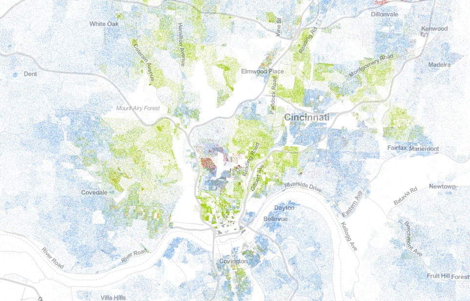
On their map each dot was assigned one of five colors based on the racial and ethnic affiliation. Whites are blue; African-Americans, green; Asians, red; Hispanics, orange; and all other racial categories are coded as brown. Cable used publicly available 2010 data from the U.S. Census Bureau.
When viewed in its entirety from afar, the map makes cities look like integrated places with a merging of all the colors to create a purple shade. This, however, is not the most accurate portrait of the racial segregation found throughout American cities.
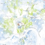
When viewing Cincinnati at a more detailed level, for example, one can see the clear separation of White, Black, Hispanic and Asian populations.
The dots are evenly distributed throughout their assigned Census Block, so some dots (or people) appear to be living in areas where they cannot (i.e. parks, water, streets).
The specific areas of interest inside Cincinnati city limits are several Uptown neighborhoods where a dense cluster of Asian individuals live, and the Lower Price Hill and East Price Hill area where a small concentration of Hispanic individuals call home.
When looking elsewhere around the region it is also interesting to observe the Hispanic population cluster in Butler County near in and around the City of Hamilton.


