The completed Rock Gaming/Caesars joint venture boasts a list of features one would expect of a casino: 354,000 square feet, $400 million price tag, restaurants, bars, a 2,500-space parking garage, and space for business meetings and conventions. None of these features should come as a shock to anyone that’s ever been in a casino.
The touted difference between Horseshoes Cincinnati and Cleveland and casinos elsewhere, is that these have been deemed “truly urban” casinos. Well, if locating in a downtown is all that’s needed to make something urban, then mission accomplished. But since a downtown is a living collection of buildings and spaces, whether something is truly urban has more to do with how it contributes or detracts from its location. And since casinos are not known to be particularly friendly urban creatures, the most recent example being CityCenter, it’s worth looking at some of the concerns expressed to the unnamed Las Vegas starchitect Dan Gilbert imposed.

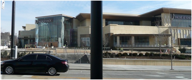
The only actual limestone you will find on the site is the wall coping around the lawn- note the whiteness of the caps compared to the synthetic stucco below.
The first thing I think of when I look at the new casino from any angle is tan. Why in the world is it so tan? Color wasn’t something that was a key talking point for the casino, though the Urban Design Review Board has now made that a priority at The Banks, but the tan-ness of the building really dominates all other exterior features. This domination lies with the use of synthetic stucco to emulate limestone. The issue here is not with modern building technology, but that it was misused in both color and implementation.
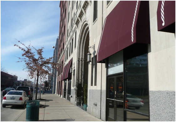
The implementation failure lies in the lack of any ornament within the stucco. One of the main reasons for using limestone is that it is one of the best stones for showing carved detailed, as can be seen just blocks away at 30 E. Central Parkway. Why try to emulate a limestone building if the only way you do that is by using fake alternate panels and stopping there?
These two issues with the exterior of the building can be summed up in one way: the Messer Pendleton Bid Package required $5,033,623 for exterior metal framing/stucco, and $6,967,980 for interior wall framing and drywall and $2,268,821 for painting and wall coverings. The casino allocated an amount for the interior walls almost twice that of the exterior walls.

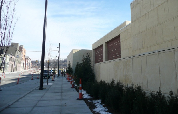
The second oddity that stands out is the number of offsets, particularly on Reading Road. Offsets are a common feature of large single-story buildings, like Wal-Mart and Kroger, to break up the mass of these behemoths. But what’s the goal here? To confuse the pedestrian or neighbor across Reading into thinking that these are multiple windowless buildings? Admit you’re a grand building like Music Hall or Union Terminal. Walking west down Reading is like passing by massive stone boulders. There’s no beauty or nuance to the walls save for two large brick panel insets and foundation plantings.
“With the strong support of this very active, urban-focused community, our team has been working for more than a year to ensure that our project does not prosper alone but also benefits the surrounding neighborhoods and region. The outward facing design and pedestrian accessibility will rejuvenate this part of town, while putting thousands of people into good-paying jobs.”- Dan Gilbert- Chairman, Rock Gaming.
“Outward facing design” is a catchphrase that was repeated throughout the design process. What does that mean? To this project it means having one main entrance and restaurants with windows and a patio, quite the accomplishment for typically fortress-like buildings. But to say the design of the project is outward facing because of the openness of only 360 feet of the entire building’s facade and at only one of the intersections surround the site is like saying a restaurant near the entrance of a mall is outward facing because it’s on the exterior of the building.

Richard Rosenthal was right about his concern over a “gully-like” feeling down Reading. In fact, it’s a quarry.
Urban design was really were there was the most input from local groups on how the casino will most likely affect the everyday life in the public realm around the casino.
Terminated vistas – views that focus on a deliberately chosen object or scene – is a historical design concept used to draw people towards a building and create the appearance that destinations are closer than they appear, encouraging pedestrians to walk.
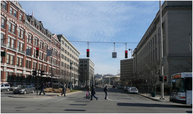
In the case of the casino, the site’s prow-shaped western end at the corner of Central Parkway, Reading and Eggleston creates the opportunity to terminate the view looking east down Central at the casino entrance and the developer has taken that opportunity. Again, as with the offsets, there is a lack of grandness to the view as the casino is dwarfed by the height of the buildings leading to it down Central, rendering it almost insignificant.

The view down Pendleton towards the casino would sad if it wasn’t so tan. No pedestrian connectivity, no windows, not even roof treatment. Nothing.
While the focus of activity for the casino will be at its entrance and new lawn for the county jail, the opportunity for Pendleton lies in what happens north of and down Reading.
From the site’s layout, you can see that building coverage isn’t great on either side of Reading Road for certain spans. And oddly enough, the casino chose to build near the street for the span west of Pendleton where there are no buildings on the north side of Reading, and then chose to back away from the street for its loading docks for the span east of Pendleton where there are buildings on the north side of Reading. And since Rock Gaming owns the stretch on the south side of Reading, it’s extremely doubtful that organic infill development ever occurs in this area.
To end where the casino does, urban casinos are not uses that fail for any reason other than over taxation. When the casino opens and rightfully provides a local opportunity to keep the poor man’s tax from leaving for Indiana or Las Vegas, let’s be careful not to confuse its popularity with quality.
This guest editorial was authored by Eric Douglas, a native of Grand Rapids, MI who currently lives in Covington’s Roebling Point neighborhood. Eric is a member of the Congress for New Urbanism and earned a Bachelors of Science from Michigan State University. Since that time he has worked for Planning, Community Development and Public Works departments in Cincinnati, Indianapolis and Detroit. If you would like to have your thoughts published on UrbanCincy you can do so by submitting your guest editorial to urbancincy@gmail.com.


